


You share the form link; many open it and few send it. The gap is not luck. Much of it comes from the form itself: how many fields it has, their order and how clear they are.
What the research says
The Baymard Institute has studied store checkouts for years. In its survey of abandonment reasons, 17% of US online shoppers said they abandoned an order because the checkout was “too long / complicated”. Its testing found the average checkout shows 23.48 form elements, while a well-designed one needs 12 to 14.
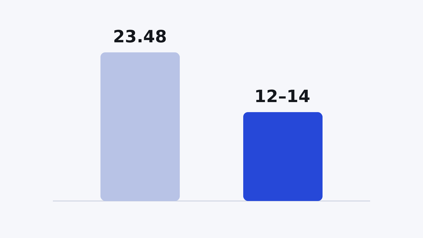
A checkout is a form like any other: every extra field asks for time and a decision. The same pattern shows up in sign-ups, surveys and job applications.
Five steps that make a difference
- Remove every field you do not really need. Ask of each question: will I use this answer?
- Keep questions in one column, with each label close to its field.
- Explain what is expected before typing, not after an error: the format, the limit, and whether the field is required.
- Split a long form into pages or show it one question at a time, with a progress bar that says how far along the person is.
- Put a clear error message next to the field itself, and keep what the person typed.
These steps match Nielsen Norman Group's recommendations in its article on form usability: keep it short, use a single column, distinguish required fields, explain formats up front, and make errors highly visible.
How to apply them in Formza
- Conversational mode shows one question per screen; turn it on from Settings.
- Page breaks split a standard form, and the progress bar shows to visitors.
- The required asterisk and the “This field is required” message appear beside the question, and you can reword that message per language in “Form texts”.
- The analytics page shows how many people visited, started and submitted, so you can see where people stop.
- On Pro, the form keeps partial answers, so someone who comes back before sending does not lose what they typed.
Start by removing before anything else: the fastest form is the one that holds only what you will use.
Sources
- Baymard Institute — Cart Abandonment Rate Statistics (baymard.com/lists/cart-abandonment-rate), last updated September 2025.
- Kathryn Whitenton — Website Forms Usability: Top 10 Recommendations, Nielsen Norman Group, May 2016 (nngroup.com/articles/web-form-design).


